UEA
ENV
CRU
Homepage
SeaLevel
CRU links
CRU staff
CRU data
External links
InterpretingCC
Norwich weather
Foulsham
Cancer Research Fundraising
Homepage
Meetings
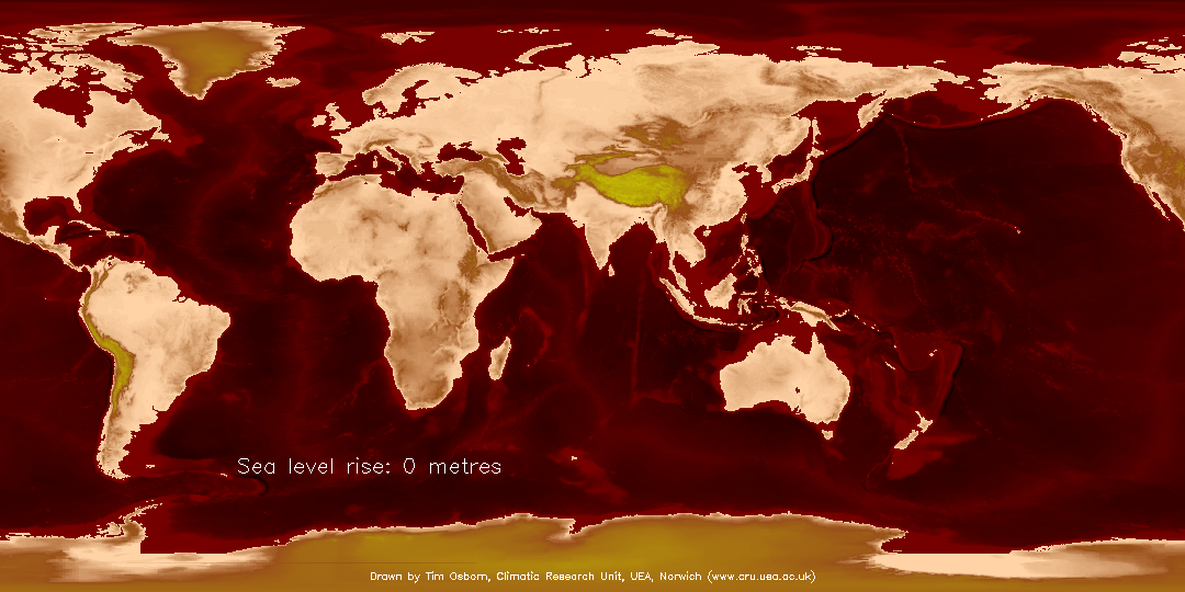
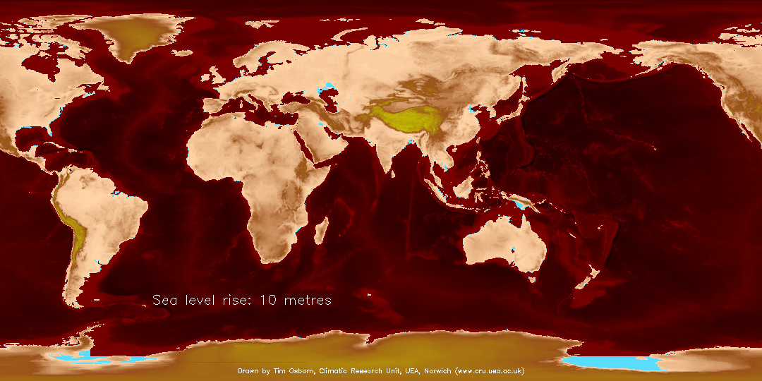
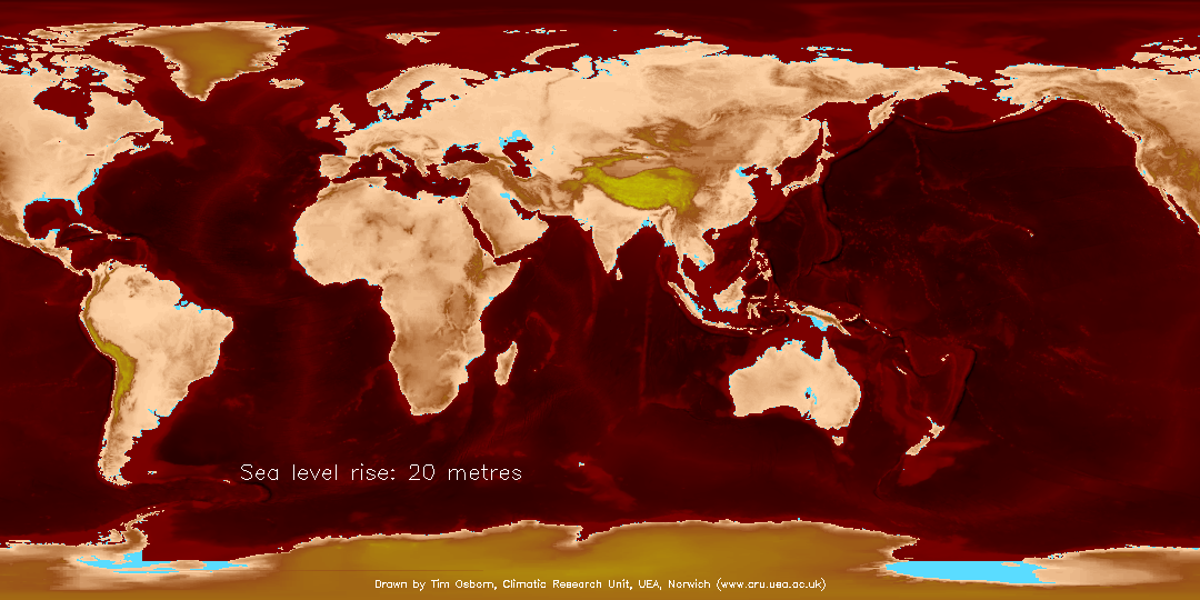
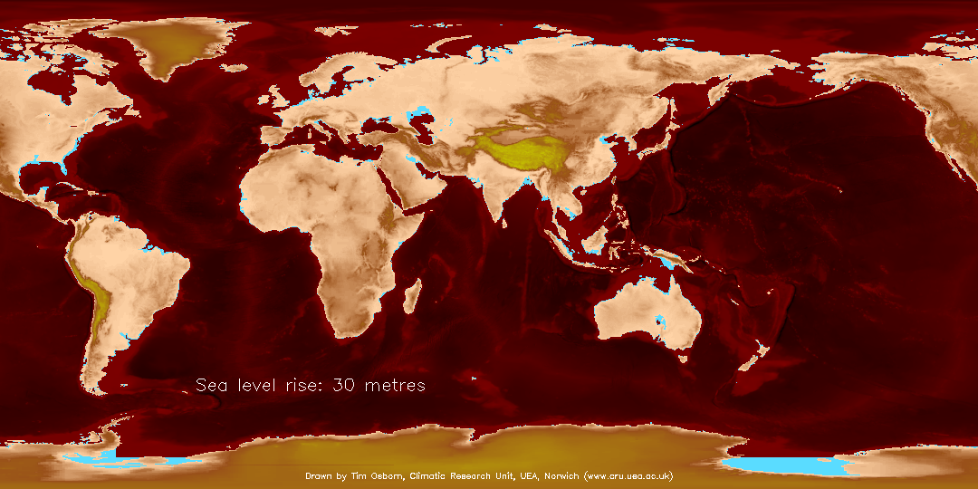
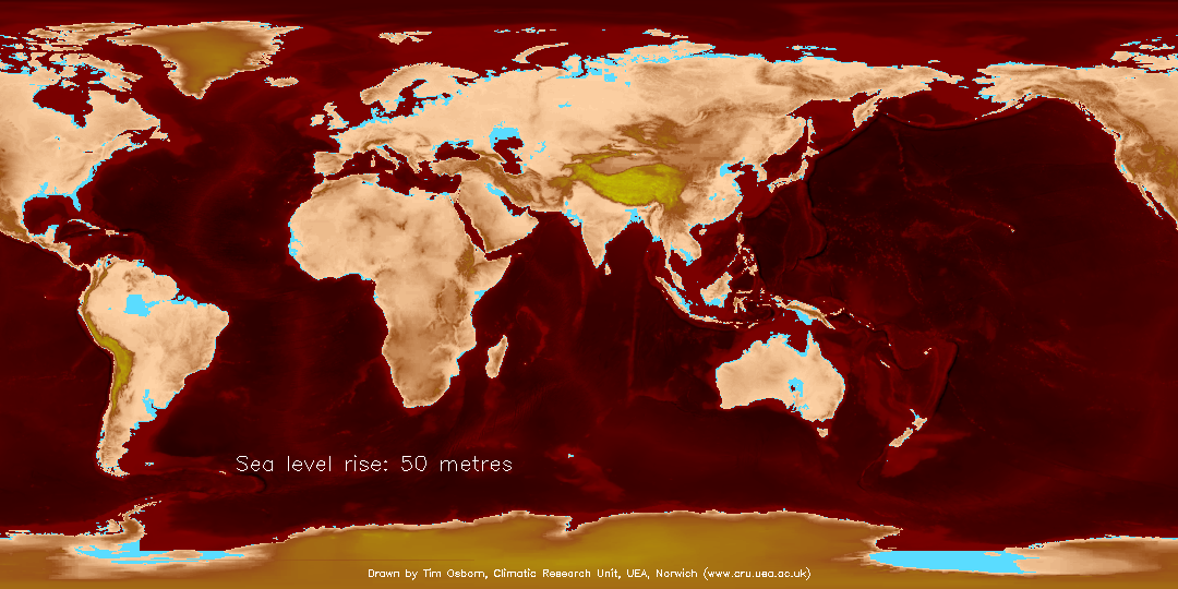
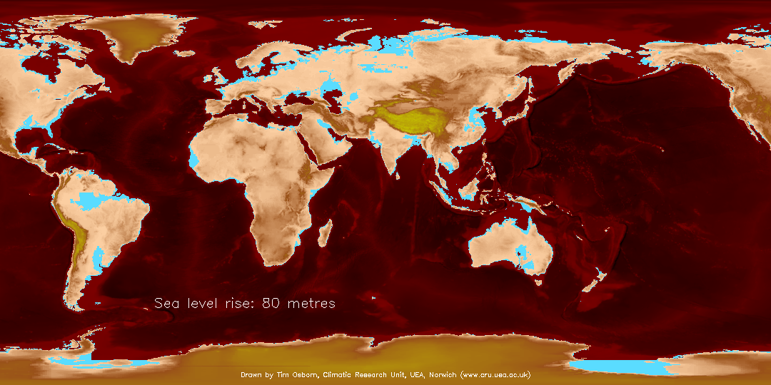
The maps on this page illustrate the location of regions that might be vulnerable to very large amounts of sea level rise. They simply show, with blue shading, those regions whose average elevation is within 10m (or 20m, 30m, etc.) of the current sea level, and thus might be permanently inundated if average sea level were to rise by 10m (or 20m, 30m, etc.).
Some caveats must be noted:
- Even the lowest amount of sea level rise shown here (10m) is far above the range of projections estimated by the IPCC for the 21st century (which has a maximum of less than 1m). Thus these maps are not likely to be relevant unless you are interested in projections far beyond the 21st century, or if the IPCC projections are greatly exceeded by much more rapid melt of the major ice sheets.
- Any grid box whose average elevation falls within the given sea level rise is shaded blue, regardless of whether it has a direct connection with the open sea or whether it would be protected from permanent inundation by coastal flood defences.
These images may be used only if Tim Osborn is acknowledged as the originator and copyright holder.
The small images show just part of Europe. Click on any image to obtain the global map.


Images for southern Asia.


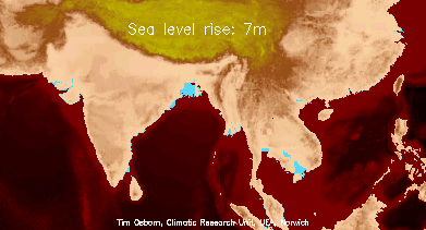


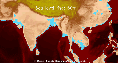
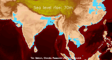

These images may be used only if Tim Osborn is acknowledged as the originator and copyright holder.